
Friday, 17 December 2010

Thursday, 16 December 2010
Deadline Time Planning
Our deadline for our digipak and planning tasks is tomorrow so I will be working purely on photoshop over the next few days to try and accomplish a finished product before 4:10 on friday I still have 2 tiles to do as well as adding the copyright details to my finished advert and tiles.
I have downloaded a 30 day free photoshop trial so can take the remaining work home to do if I need some more time.
Friday, 10 December 2010


Wednesday, 8 December 2010
Screen Grabs
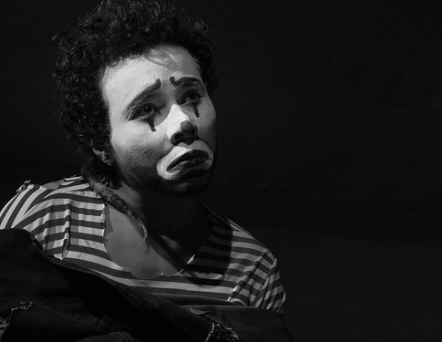
Here are some shots of the editing I have done this lesson.

Above is the edit of a close up of the mime, and below is a draft version of a possible album cover and the edit. I am not happy with the text and will play around with the layout over the coming days.

Above is the edit of a close up of the mime, and below is a draft version of a possible album cover and the edit. I am not happy with the text and will play around with the layout over the coming days.
Monday, 6 December 2010
Some Feedback
I have already received some feedback from posting the first draft to facebook, including these comments:
Milly Morris- "This is great. The font looks amazing, it must of taken you absolutely ages. I really like the layout and the positioning of the model. I think that the white text could be a little bolder :) It reflects an indie/alternative style of music which could also be related to Folk. Really like it. "
Fran Collingham- "Brill. Cap down the O and N in Out Now for better readability."
Nancy Knesevic- "Since you are focusing on the single, it might be better to focus on "new single" this is the life, sometimes, with a young band, people remember the single better than the name of the band (especially when it's long..) Ie: I bet you look good on the dance floor is the single that made Arctic monkeys famous... So your ad answers the question "who sings that new single" as opposed to "look here's another new unknown band"."
From these few comments I have already got some points to work on, in my next lesson. I have taken into account these suggestions and am going to try and work on tightening up the clarity of the font, take down the capitals from 'Out Now' for better readability, and to try and keep the advert cohesive and concise, I am going to change the focus of the advert from 'Tourist History', the album name, to 'This Is The Life', the EP title. Hopefully this will result in a complete image and draft. I will post again if any more feedback is commented.
From these few comments I have already got some points to work on, in my next lesson. I have taken into account these suggestions and am going to try and work on tightening up the clarity of the font, take down the capitals from 'Out Now' for better readability, and to try and keep the advert cohesive and concise, I am going to change the focus of the advert from 'Tourist History', the album name, to 'This Is The Life', the EP title. Hopefully this will result in a complete image and draft. I will post again if any more feedback is commented.
First Draft- Magazine Advert
Here is the first draft of my magazine advert, this time with final edit and text. I have posted it onto facebook and tagged members from my target audience into the picture so it appears on their home feed. I have added these questions as the caption, and am now waiting for some responses to gauge feedback.

Do you like the design? Is it readable?
Does it give you enough information on the release?
Are there any things you would change/don't like?
Do you think it should include a star rating/quote from another source?

Do you like the design? Is it readable?
Does it give you enough information on the release?
Are there any things you would change/don't like?
Do you think it should include a star rating/quote from another source?
Audience Feedback

From the draft version of my print task, and suggested location shots that I posted to facebook I received comments, all from people aged within the target audience (bar two, who were slightly older) here is a transcript of the comments-

Beth Walsh-
"A big yes to Reindeer court -
I like the ambiance - it's moody, like your mime image. I also love the clown against the plain red as the simple colours make a strong impact."
Al Pagan- "Agree with Beth, and I like the hands making a heart shape - could be used as running theme."
Sophie Milne-

"I LOVE
the way you've done the text,that looks really good"
Helen Campbell- "I think it's really interesting and it stands out :D and it's suited to your song genreness."
Joanna Loucas- "Oh thats well gd! I love the writing, it's amazing and i love the make up on milly."


Cat Jones- "Just centre the pic looks like she too far the the left (well i think its left)"
Joanna Loucas- "Oh thats well gd! I love the writing, it's amazing and i love the make up on milly."
The feedback I received was pretty much positive, which is a good thing, although at this stage they are all draft versions, so the lack of critique means that I have little points to work on and improve specifically for my target audience. I am going to post the finished versions onto facebook, and see if opinion differs.
Audience Research
Target Audience Profile
14 - 25 years old
Unisex
Hobbies: Going to gigs, playing instruments such as guitar and drums, going to the cinema, drinking, smoking, driving, drawing, writing.
Media Consumption: The target audience would buy music magazines such as NME, Vice, and Pitchfork and watch music channels like NME and Q They would also listen to radio stations such as 'BBC Radio 6' and 'BBC Introducing'. Websites such as ‘Last.Fm’ and ‘Spotify’ would also be useful for the audience as they allow them to find new and interesting artists.
Consumption Patterns: Would typically avoid most chain stores, and aim to shop at independent boutiques and vintage fairs, although migh frequent Top Man or online shops such as ASOS and Urban Outfitters. Would download or buy cinema tickets to independent films such as ‘Juno’ and ‘Eternal Sunshine of the Spotless Mind’. Would like to own and drive a Vespa moped and would usually buy records at a record store or download mp3's, would use the internet to find out about new bands.
Musical Interest: Two Door Cinema Club, The Maccabees, Los Campesinos, Bombay Bicycle Club, Hot Chip, Vampire Weekend, Good Shoes, etc. Would typically go for 'underground' artists produced by indie record labels, as opposed to 'polished' mainstream artists. These people are more likely to illegally download music in bulk, and pay for merchandise, gigs/festivals and music magazines instead. For this reason, the digipak and advert would have to be as eye-catching as possible to encourage them to purchase it, and must appeal to their demographic as much as possible.
Sunday, 5 December 2010
Advert Research- Text

The text on the advert gives a quote from a review, the release date, the formats that it is being released on to, as well as a website to get a free download from. These are all ideas that I will be including on my magazine advert.
Saturday, 4 December 2010
Advert Location
My research has revealed that independent bands, who subsequently have a smaller budget for advertising if they don't come from a mass conglomerate, would more likely feature their adverts in half a page of a music magazine as it is cheaper.
As Two Door Cinema Club are managed by Kitsune, an independent label I am going to design my advert landscape, so it can fit a smaller space therefore costing less money for the band. Much like the image of 'The Drums' who are a similarly managed and produced band, with much the same target audience.
The advert would most likely be printed in magazines, like NME, Vice, Q and The Big Issue, as these feature bands from the same style with relevant audiences.

Friday, 3 December 2010
Screen Grab

 Here is the progress of my magazine advert so far, from the original image to the half finished edit.
As the new computer system installed on the college computers doesn't allow fonts to be installed into Photoshop, I came up with a solution to the problem. I didn't think any of the pre installed fonts stood out enough, and if they did, they did not suit my edits on the picture. So I took a photo of some scrabble letters and cut each letter out using the marquee tool, and then pasted them into a new layer above the background edit. This meant I could choose my own base line, and haphazard layout for the text, as well as give an over all 'hand made' and 'vintage' feel to the piece. Although not very time effective, and painstaking, I think the overall effect is positive and next lesson am going to see if I can find a font that will fit visually with this main focal point.
Wednesday, 1 December 2010
Digital Technologies
At the start of the week I set myself some targets to improve my confi
dence with the use of the digital technologies I will need to complete the tasks.
I have worked on becoming more confident with photoshop, using online tutorials like this site- http://veerle-
v2.duoh.com/blog/comments/photoshop_vintage_effect/ which has helped me learn techniques such as adding adjustment layers using colourized curves.

I also watched this youtube video, that gave me some tips on how to create smooth edits and movement within a stop motion film.
This lesson I am going to begin my Animatic Story Board, which should help me get to grip with the Editing Suite and the insertion of multiple frames, and I will blog about my progress later.
I have yet to find out how to print onto gloss paper and scan in images using the college printers, as I took a change of course and began with my Magazine Advert as opposed to my Digipak and therefore don't need to use scanners as of yet.
Possible Location Shots
I have tried to seek out locations within Worcester that will give the effect of old fashioned/vintage films as well as a slight mise en scene of French life. Although none of these locations are perfect (my budget wouldn't stretch to a weekend in Paris)I think some of them might work in certain shots of our video. Especially 'Cafe Rouge' where tables and chairs are put out in the street during the day, with the french menu printed on the glass, that would be a very useful shot for the scenes between the two main characters and their initial argument.


Monday, 29 November 2010
Album Artwork Research
Gliss- Devotion Implosion

Washed Out- Feel it all Around

These images all try and portray an image relevant to the Auteur Theory (Not being influenced by the 'mainstream hype' with individual ideas determined by their creativity alone) but as this style of photograph and the 'Indie/Hipster' scene has grown in popularity, in actual fact with this growing niche becoming more and more mainstreamed into the popular culture cohering to Adorno's theory of popular media and music products being characterised by standardisation (they are basically formulaic and similar) and pseudo-indivitulisation (incidental difference make them seem distinctive, but they're not.)


The effect of using an image that is highly over exposed using the effect of an abstract close up or image, usually with a sepia/black and white or film grain effect is used widely within the indie genre specifically. The effect creates a vintage, old fashioned feel, reminiscent of negatives from film reels, an effect which we hope to create in our own video, therefore I am going to experiment with creating this style of photo. I have looked up techniques to create film effects in photoshop, I found this website particularly useful and cohesive- http://www.ehow.com/list_6438157_film-effects-photoshop.html
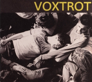
Voxtrot- Raised by Wolves
Washed Out- Feel it all Around
These images all try and portray an image relevant to the Auteur Theory (Not being influenced by the 'mainstream hype' with individual ideas determined by their creativity alone) but as this style of photograph and the 'Indie/Hipster' scene has grown in popularity, in actual fact with this growing niche becoming more and more mainstreamed into the popular culture cohering to Adorno's theory of popular media and music products being characterised by standardisation (they are basically formulaic and similar) and pseudo-indivitulisation (incidental difference make them seem distinctive, but they're not.)

Creativity
Looking at album artwork from bands within the indie genre, as well as Two Door Cinema Club's
own releases, I have taken an interest in the use of real life photography, as opposed to photoshop artwork.
Two Door Cinema Club- Tourist History

This album features a photograph of a cat that has been edited using photoshop purely to draw lines from the eyes of the animal, and overlay the bands logo and album title. Little else has been done to the image, as you can see when taking away the font, the image itself doesn't look altered apart from the eye area and possibly a shift in contrast to create a darker lighting:

If you compare this simplistic home made approach to the works of artists like:
Empire of the Sun: Walking on a Dream

The Dutch Uncles- Dutch Uncles

Basement Jaxx: The Return of Basement Jaxx

It becomes clear that Two Door Cinema have utilised the do it yourself approach, and have created a hand made feel to their album that is reflected in the sound of their music. Much like the respective bands above and their highly edited and produced artwork, that is reflected in their own music. When the two differing styles are contrasted against each other I personally prefer the effect of using a photo. I plan to experiment with photographs either importing them into photo shop and playing with lighting and certain effects or actually working straight onto the image, taking aspects of inspiration from some of the art work researched in my following post.
In this video Sir Ken Robinson discusses the value of making mistakes and how these errors are the key to independent learning. Creativity is at the heart of the media industry and I found Robinson's views insightful on this topic. His views on the way schools can enhance or suffocate pupils creativity made me assess how much I rely on my own teachers and pushed me to become more independent and experiment more, learning from my own mistakes. From the topics discussed in the above video I am hoping to take these sentiments into my own work, and learn to embrace my mistakes whilst working with my photographed images and the edits I will make to them.
Digital Technologies- Skills Audit
I have been considering what technology skills I need to develop and have come up with these targets to try and improve on within the week, developing my knowledge by experimenting and being creative with the technologies as well as using means such as the internet to guide me through the software.
- Become more confident with photoshop, learning what all of the tools can do.
- Watch an online tutorial about stop motion filming, so I can pick up any hints to the production aspect of the filming, as well as speeding up the post production edit.
- Familiarise myself with the Editing Suite and the insertion of multiple frames.
- Find out how to print onto gloss paper and scan in images using the college printers.
Wednesday, 17 November 2010
Time Management- Target Audience
18th November - Decide on candidates for focus group - Leah
- Decide on questions that we will ask our target audience - Emma
20th November - Send a survey to our candidates via 'Facebook' requesting responses to moodboard, opinion on similar music videos from our genre and their synaesthetic imagery in response to our song - Emma and Leah
22nd November - Write up audience response on blog and assess whether plans need changing. Also judge whether aspects of our video need changing following the audience response - Emma and Leah
Monday, 15 November 2010
Music Video Analysis
This video is by an Independent band The Mystery Jets signed to the Rough Trade label. The track is about a woman who's boyfriend is in love with another girl as well as herself. The video follows this narrative, but has taken a comic standing on the lyrics 'He's half in love with Elizabeth' and used Queen Elizabeth as the 'other woman'. Although through the filming this isn't overtly clear until the final minute, so it appears a fairly redundant narrative to the unsuspecting audience although filmed quite artistically, but once the twist has become apparent and the subtle hints before are finally realised it is clear that the video is actually entropic.
The video coheres to Andrew Goodwin's theory illustrating a relationship between the lyrics and the visuals, with the visuals illustrating and amplifying the lyrics. For example there are some very illustrative shots, the mid shot of the lead male protaganist leaping out of bed in a suit coincides on beat with the lyric 'How can you trust a man that sleeps in his clothes?' There is also a lot of genre related style present with art house edits and effects, such as the very short incorporations of stop motion and the very urbanised muted colours and setting, also the first few seconds illustrate an alternative video as the titles portray a film style video with a narrative and the use of subtitles within the video are not typically conventional of mainstream and the whole video being shot in black and white.
Overall I would class the video as amplifying, as even though the video is what the lyrics are talking about, the spin the director has put on the lyrics including the references to the Queen and not following the lyrics to the letter make it a non illustrative video.
The cultural studies approach would take the stance of:
The preffered reading- It is natural to have problems within a relationship and the proposed relationship between a 'common' man and her Royal Highness the Queen is not a problem.
The negotiated reading- Some people have problems within a relationship, and relationship between the man and his 'mistress' are used for comic effect in this specific example and should not be taken too seriously.
The oppositional reading- The relationship problems should not be a source of entertainment, and the relationship between a 'common' man and the Queen is highly inappropriate and offensive to the royal constitution.
The video does not really cohere to the Proppian theory although it could be viewed that the man is the male hero seeking something (the queen) and the Princess that acts as the heroes reward is the queen. This theory is difficult to apply to the video as the roles do not cohere with each character and it doesn't really help push the narrative forward by classifying these roles.
The Strauss theory of binary opposites can be applied; as the audience we feel more connected to the female character, as she is the one victim to the man's bad behaviour and she has done nothing wrong so is therefore seen as the good character. Although the male is the dominant character within the shots, we find ourselves feeling sympathy for the female.
Perhaps the most effective narrative theory to apply to the video is Todorov's:
Equilibrium: The first shots revealing the couple in a happy relationship
Disequilibrium: The shots illustrating the break up, as the audience begins to realise there might be 'another woman'
Recognition: The woman finds clear evidence of the man's affair and the audience realise who it is in the basketball shots
Reperation: The man goes after the woman and apologises
New Equilibrium: The woman accepts and thinks that all is solved, but the man is waving at the Queen and therefore we are really back to square one.
Sunday, 14 November 2010
Music Video Auteurs
The auter theory holds that a director's film reflects the personal creative vision, as if the director were the primary author. In spite of the production of the film as part of an industrial process, the author's creative voice is distinct enough to shine through all kinds of studio interference.
(Definition taken from wiki)
Michel Gondry:
Gondry is a French film, commerical and music video director as well as an Academy Award-winning screenwriter. He is world renowned for his visual style and manipulation of mise-en-scene. He has vast works, but some of his most noteable music videos to date include:
-Mad World; Gary Jules -Human Behaviour; Bjork
-Star Guitar; Chemical Brothers -Come Into My World; Kylie Minogue
-Gimme Shelter; The Rolling Stones -Around The World; Daft Punk
-Denial Twist; The White Stripes -Protection; Massive Attack
Gondry is deemed as an auteur. His films and video's all have key signatures of his creative character. Most involve:
- Tecnical wizardy
- A repetitive nature
- Long takes as opposed to short cuts
- Illusions
The videos he produces mostly cohere to Andrew Goodwin's theory, where the video amplifies the music adding another layer of meaning to the sound via the visuals, and Bordwell and Thompson's rhythmic theory that the pace of the cuts are in time to the beat of the track.
I have chosen to focus on these two tracks as they share aspects and techincal skill that I hope to recreate in some form in my own video.
Fell In Love With A Girl:
The video is a lego animation, featuring Gondry's son at the begginning building the initial blocks. It was shot frame by frame with each frame having the lego bricks rebuilt, sometimes in a complex manner to seem as if it were an actual shot, and then edited together to give the illusion of motion. One section, lasting only a few seconds, used computer animation to simulate the lego bricks. The video won three MTV video awards in 2002, and also received a nomination for Video of the year.
The lyrics do not match what we visually see on the screen, and therefore it is a disjunctive and entropic video, with no defined narrative or binary opposites involved. The band don't literally feature in the video, although the lego bricks are built to form the lead singer Jack White and Meg White the drummer, so although they are not present themselves the artist is still technically featured in the video. I would categorise this video as an 'Art Clip' in keeping with Sven E Carlsson's definition- 'If a music video clip contains no perceptable visual narrative and contains no lip-synchronized singing then it is a pure art clip.'
I love the way the video feels hand made and not over produced, even though it has a large post production edit. The stop motion aspect of the video creates a fast paced and disjointed edit that isn't typical of his usual signatures, but creates the right pace and effect to suit the music.
The Hardest Button To Button:
The video uses a technique called 'pixilation animation' to give the effect of a line of drum kits and amps multiplying in beat to the song. In one sequence, Meg is seen playing the bass drum on a railway platform and on every beat, a new drum appears just ahead of her and she appears behind it playing to the beat. This was achieved by setting up a trail of bass drums with Meg being filmed performing a single beat on the last drum in the line, which would then be removed. This would continue on down the line as she played a beat on each one. The final video was edited to include the drum beats with the sequence reversed, making it appear as if the drums were being added and not taken away.
This is in keeping with Gondry's stylistic signatures, as he creates an optical illusion that keeps the audience enthralled, as well as creating a dynamic video that is paced perfectly to the beat of the song and yet remains it's disjunctive and entropic elements, that retain his distinct creative voice.
Friday, 12 November 2010
Rough Narrative Outline
We have decided to use mimes in our video as the leading characters that will push the narrative forward.
The rough outline of our video will begin with two mime characters who are clearly unhappy with their relationship, beginning with the pair on a sofa. The rest of the video will be carried out within flashbacks of the happier times of their relationship. For example, shots of them on a bike ride and shots of them in coffee shops chatting and having fun, all integrated with some stop motion frames. These shots will be filmed in film grain with a lighter mise-en-scene to differentiate between past and present. Due to the miming actions and the connotations and appearance of the mime, these shots will appear slightly comical but not overtly 'laugh out loud' funny; which should hopefully create a pleasant and easy to watch video, but the content will be easy to identify with and relates to the lyrics and the jovial sounding melodies of the song.
The lead mime character will reach breaking point with his girlfriend when he catches her in bed with a clown character, this will be a dramatic scene yet comical due to the nature of the costumes, the rest of the video will contain contrasting shots of their unhappiness illustrated in the mime lyrics and the shots of the pair on the sofa as well as flashbacks to happier times.
The end of the video will be cyclical, panning out from the original shot of the pair on the sofa, finally revealing why they are so unhappy and upset within their relationship.
Thursday, 11 November 2010
Pitch
Here is the copy of our Pitch that we presented to the class to get reliable feedback from what they thought of our prospective ideas. We used flash cards to pitch the presentation along with the power point below to highlight our key ideas:
'This is the Life' Music Video Pitch
We received some constructive criticism about the logistical aspects of our idea, as we had planned to film on Friar Street in the town centre, due to its old style feel, with cobbles and Tudor buildings. Our audience alerted us to the fact that it may be difficult to get shots in a busy street with pedestrians walking past, so we have decided to film on a week night in the early evening as that would mean the street is pretty empty and will provide a nicer light and therefore a stronger mise-en-scene for these shots. Most of the comments we received were positive, and in particular people liked the stop motion concept as it 'adds another dimension' and the idea of the mime artists as the focal point as they said it made the video 'original and puts a twist on the indie conventions.'
Another comment we received was about our choice of our target audience demographic. We decided to target an audience based from A -C2 on the Jicnars Scale, but as our age ranges from 14-25 years this would have to be based on the majority of their parents income, as they will mainly be students and not yet be in a line of work with a regular salary. Our feedback generally agreed with these pshycographics but some comments stated that this could perhaps be too broad a target audience to hit. We decided to ask our peer group whether they found this true, and discovered that even males and females from a high earning back ground would listen to the music and conform to the fashion and styles of the indie genre, as well as students from an average to lower salary family. Therefore we have decided to stand by our original target audience decision.
Wednesday, 20 October 2010
Mood Board Draft One
For our music video we have decided to use the song 'This is the Life' by Two Door Cinema Club. It fits into the genre of indie music, so I have thrown together images relating to the indie genre and the conventions and stylistic features that we are going to use in creating the video. I have illustrated the visual stimulus that would be associated with this genre- with examples of existing bands, fonts, stop motion animation, film grain, and the general style associated with the music, in the hope that this will give a clearer idea to the respective audience.


Saturday, 16 October 2010
Digipak Research

This is my favourite digipak release from a band, it is essentially twelve blisters containing a 3 inch cd featuring one track on each disk, which had to be popped through the foil in order to be played. All credits were printed out on a medicinal information sheet and contained warnings on the possible side effects of listening to the band. Designed by Farrow/Spaceman.

The whole concept is pursued fully, with the hospital connotations continuing with every aspect of the digipak, from the ingenious track listings on the medicinal sheet, to the print on the side of the packet stating '12 tablets 70 min' in the typical pharmaceutical font, and the band name with a registered trade mark sign that not only anchors down the connotations of hospitals and treatment, but also the concept that it is an album and not just a prescription packet.
Digipaks
Digipaks typically consist of a gatefold (book-style) paperboard or card stock outer binding, with one or more plastic trays capable of holding a CD or DVD attached to the inside. Since Digipaks were among the first alternatives to jewel cases to be used by major record companies, and because there is no other common name for Digipak-style packaging made by other companies, the term digipak is often used generically, even when the media holder is a hub or "Soft Spot" rather than a full plastic tray.
Digipak-style packaging is often used for CD singles or special editions of CD albums and the tall DVD Digipak is used as a premium package for DVDs and DVD sets. Because such packaging is less resistant to abrasion than jewel cases, it tends to show signs of wear relatively quickly.
Digipak-style cases grew in popularity among record labels and recording artists in the early 2000s.
Historically, Digipak was only available in large quantities. However, AGI has recently introduced a new product called digipak i-create for the consumer market. Digipak i-create is a web-supported concept that is aimed at the download, music, photo and creative markets.
- Extracted from Wikipedia

Friday, 15 October 2010
Further Research
As the genre we have decided to focus on is under the 'Indie and Alternative' genre, I have began to look at video's that fit into this classification, and note some of the usual conventions that feature in these sorts of video.

I have decided to focus on Alternative/Indie music videos for my research, as the song I have in mind fits into this genre.
The video 'Ooh La' by The Kooks illustrates many of the conventions typically found in pop rock / alternative videos. It focuses around a loose narrative in which a girlfriend of the band member is run over by a car, however it is not overtly structured around this and is most definitley an amplifying music video, as although this event is never mentioned in the lyrics the song is about the relationship between him and his past girlfriend- 'and ooh la, she was such a good girl to me
And ooh la, the world just chewed her up, and spat her out.' It focuses more on shots of the band, as well as shots of day to day life that are prominent within the video. It also incorporates old film footage, and is filmed with a grainy filter in black and white.

Another technique prominent within alternative music videos is Stop Motion. An animation technique to make a physically manipulated object appear to move on its own. The object is moved partially between individually photographed frames, creating the illusion of movement when the series of frames is played as a continuous sequence.
This technique is used within Kate Nash's music video- 'Foundations'
This video is also Amplifying, as although the lyrics are not acted out step by step the general theme of someone in a relationship becoming increasingly disillusioned by their partner is pretty dominant in the video. I love the general mise en scene of a colourful and quirky setting, alongside the use of ordinary house hold objects that are used to illustrate the message and emotions of the video with the Stop Motion technique.
Emma and I liked these techniques so much we decided to experiment with film grain, different effects like the sepia and black and white tones, as well as stop motion animation using people and objects. Here is the finished project of our short experimentation with these techniques:
Thursday, 14 October 2010
Planning
We had to ask for permission to use the song 'This Is The Life' by Two Door Cinema Club, so we emailed the manager of the band telling him about our course and if he and the band would allow us to use it.

After choosing the song it allowed us to have some clearer ideas for our video, from the use of the lyrics, to the general feel of the track. This video fits into the Alternative/Indie genre so I am going to research videos already produced by Two Door Cinema Club as well as other music videos that fit into this category.
Here is the song we have chosen-
Monday, 11 October 2010
Media 2.0
Flew suggested that the Internet stands out because it is networked, interactive and enables two way communication. Flew also suggested that the internet allows users to be both producers and consumers of the content.
In contrast to the past, before the development of the internet audiences can now be seen to be both producers and consumers of content. This is evident on sites such as 'YouTube' as the audience are able to not only watch and comment on videos, but upload and create their own videos. Social networking sites such as MySpace and Facebook also allow audiences to be both prouducers and consumers. MySpace allows consumers to upload their own music and get reviews on it, as well as enabling audiences to watch and subscribe to other's music.
The shift from Media 1.0 to Media 2.0 allows the task of creating a promotional package for an album release a lot easier. Instead of having to physically take the package to people to get feedback and to promote it, you can just upload it online and get instant feedback off the target audience. Websites such as Twitter, Facebook and MySpace are perfect for promoting artists.
As David Gauntlett suggests we no longer get fed the views of the corporations such as the bbc and have to work our life around their schedules, we can now take control of our own media, producing and watching media products in an accessible and most often free alternative using the internet. The media world has shifted from a 'Push' media to a 'Pull' media.
As David Gauntlett suggests we no longer get fed the views of the corporations such as the bbc and have to work our life around their schedules, we can now take control of our own media, producing and watching media products in an accessible and most often free alternative using the internet. The media world has shifted from a 'Push' media to a 'Pull' media.
Sunday, 10 October 2010
The Cultural Studies Approach Perspective on Audience:
David Morley developed a theory to understand how the media might be powerful in influencing audiences through effects research, yet also encourage researchers to understand the active nature of certain audiences using the gratifications theory.
The approach sees audiences as active, stating that different audiences adopt different standpoints in relation to the values expressed within a media text:
Preferred reading- The audience recognise the values being offered by the text and accepts them as natural and correct.
Negotiated reading- The audience recognise the values in the text as legitimate and accept them in general, but adapt their reading of the text to fit in with their experiences and interest.
Oppositional reading- The audience understands the values in the text, but disagrees with them and rejects them.
This theory contradicts the 'Effects Model Theory' as it opposes the psychological methods of testing and instead utilises the sociological methods of testing audiences consumption. Where the Effects Model views audiences as passive, sometimes referred to as the Hypodermic needle theory where the message is 'injected' into the audience and psychologically changes their behaviour, the Cultural Studies theory views audiences as active which then enables audiences to take different reading positions in relation to a media text.

Saturday, 9 October 2010
Friday, 8 October 2010
Theroists on Music Videos: Goodwin
Goodwin has identified a number of key features in music videos, I have tried to find the best example of a video that encorporates as many of these features as possible. Although I feel that the major flaw in these categorisations is that they are too broad to allow a tight encompassing of a particular genre to a music video, as it is difficult to find a video that has all of these aspects integrated. However it is obvious that these are common traits in individual videos.
-A relationship between the lyrics and visual, with the visuals illustrating, amplifying or contradicting the lyrics. (The song is about 'partying in the usa' and the video is literally, a party in the usa)

- A relationship between the music and visuals, with the visuals illustrating, amplifying or contradicting the music. (Edits are cut on the beat, the choreography is in time with the music, Miley Cyrus mimes to the lyrics and the visuals are interpreted from the essence of the lyrics and music)
- Genre related style and iconography present. (The song has a country style rhythm and melody and the visuals reflect this with the mise-en-scene of a texas desert, with westernised cars and props and costumes with 'dukes of hazard' hot pants and cowboy boots, with american flags highly prominent in the background)

- Intertextual references to other media texts may be present. (References to 'Jay Z song was on' / 'I see the Hollywood sign' / 'The Britney song was on')
- Multiple close ups of the main artist or vocalists. (A mixture of shots ranging from wide to extreme closee ups of the lead singer, frequently throughout the video)

- Voyeurism often plays a major part, especially in relation to females. (Numerous shots of women dancing suggestively from the lead singer, to girls dancing in the background, in a more voyeuristic manner)
Thursday, 7 October 2010
Theroists on Music Videos: Todorov
Todorov's narrative theory:
The theory that there are five stages in narrative structure-
* Equilibrium
* Disequilibrium (disruption)
* Recognition
* Reparation
* New equilibrium
Here is an example of this theory applied to a working example:
The first shot illustrates the equilibrium of lead singer Kyle with dark lighting and a medium close up of him sleeping in bed.
The disruption occurs when someone knocks on the door calling his name and waking him up. This is illustrated with a close up on his face, and a shift in lighting and perspective giving the impression of morning light.
The recognition begins when we see a close up of Kyles legs (in jeans, which is also a link to the title of the song) as he gets out of bed, and he walks over to the curtains where a wide angle shot reveals him opening the curtains and looking out to the view of the morning, resulting in a change to bright lighting and the beginning of the music, signalling a start to the video.
The reparation is signalled by Kyle walking on stage to the gig he is performing at, finally completing the task he was woken up to do. With a drastic lighting change, to red strobe lights and a typical mise-en-scene of a bustling rock gig, with fast edits on beat and close ups of the band members. We then see Kyle come off stage and work his way through numerous house parties, with point of view shots, and a hand held camera. He walks the streets until he arrives back at his hotel.
The new equilibrium is restored as Kyle makes his way up to his room and we see him fall onto the bed illustrated in a slow motion wide shot, as he gets ready to go back to sleep.
The representation of male figures in the video is residual in the fact that men are viewed as slovenly creatures with poor hygiene and lazy tendencies, leading a hedonistic lifestyle of drugs rock and roll and parties, as well as the stereotypical 'rock and roll' band. Having a young white male construct the narrative is also typical of music videos, and therefore the video doesn't really challenge these residual stereotypes of gender, and the only emergent idea is that of the females in the crowd scene who are showed to be in the midst of the action being pushed and dancing wildly, as this view of 'moshing' is more commonly associated with men.
The theory that there are five stages in narrative structure-
* Equilibrium
* Disequilibrium (disruption)
* Recognition
* Reparation
* New equilibrium
Here is an example of this theory applied to a working example:
The View - Same Jeans (Official Music Video). Watch more top selected videos about: The View
The first shot illustrates the equilibrium of lead singer Kyle with dark lighting and a medium close up of him sleeping in bed.
The disruption occurs when someone knocks on the door calling his name and waking him up. This is illustrated with a close up on his face, and a shift in lighting and perspective giving the impression of morning light.
The recognition begins when we see a close up of Kyles legs (in jeans, which is also a link to the title of the song) as he gets out of bed, and he walks over to the curtains where a wide angle shot reveals him opening the curtains and looking out to the view of the morning, resulting in a change to bright lighting and the beginning of the music, signalling a start to the video.
The reparation is signalled by Kyle walking on stage to the gig he is performing at, finally completing the task he was woken up to do. With a drastic lighting change, to red strobe lights and a typical mise-en-scene of a bustling rock gig, with fast edits on beat and close ups of the band members. We then see Kyle come off stage and work his way through numerous house parties, with point of view shots, and a hand held camera. He walks the streets until he arrives back at his hotel.
The new equilibrium is restored as Kyle makes his way up to his room and we see him fall onto the bed illustrated in a slow motion wide shot, as he gets ready to go back to sleep.
The representation of male figures in the video is residual in the fact that men are viewed as slovenly creatures with poor hygiene and lazy tendencies, leading a hedonistic lifestyle of drugs rock and roll and parties, as well as the stereotypical 'rock and roll' band. Having a young white male construct the narrative is also typical of music videos, and therefore the video doesn't really challenge these residual stereotypes of gender, and the only emergent idea is that of the females in the crowd scene who are showed to be in the midst of the action being pushed and dancing wildly, as this view of 'moshing' is more commonly associated with men.
Wednesday, 15 September 2010
Redundancy and Entropy
The above video, Windowlicker by Aphex Twin at first seems to illustrate a redundant view of a hip hop video, with two black males cruising the streets of an American town at night, looking for girls, using excessive slang and obscenities. This initial redundant view has a hint of irony, and the excessive swearing and over the top hairstyles give a subtle tone of exaggeration. The video develops into an entropic scene where the 'gangsta' car is pushed forward away from the girls by an enormous limousine, that is comically long. The door opens to reveal an exceptionally sinister looking white male, which is an entropic view in the context of what at first seemed to be a hip hop style video, and is completely out of place in the audience's initial expectations of the video. The man then leaps out of the limo and begins to dance wildly, whilst the 'hip hop' men watch on from their car in shock, and the two girls look on in awe. The use of a dance routine in a video is highly redundant, but this style of dancing involves strange ballet and seems almost like a dance routine from an old black and white musical film, which is an entropic idea in the context of an urbanised hip hop video. The two women who are watching, suddenly reveal their faces have become exactly like the sinister man who is dancing, which is very unexpected and a highly entropic feature, and the man and the two women get into the car and start driving whilst writhing together in the back seat- in a mildly disturbing scene! The redundant view of gangsters partying in the back of a limo is reversed into an entropic view, by turning all the characters into sinister caricatures of the main white male. The video ends in a typically redundant view of a hip hop dance routine, set on a beach with palm trees and dancing girls surrounding the male in bikini's. The two black males from the first scene have followed the limo, and watch on in excitement. But soon realise that the girls they first viewed as sexy, now have hideous faces. The idea of turning scantily clad sexy women into a disturbing image is highly entropic, and in juxtaposition to the glamorous setting of a hip hop video that began with a redundant view, is now turned into an ironic and entropic take on modern music videos.
The above video, Mr Ambulance Driver by the band The Flaming Lips, has an entropic introduction from a young male talking about an accident he was in, but then develops into a redundant view of the full band singing the song into the camera, with a typical mise en scene for a rock/alternative group, set in a dark, warehouse with spotlights and the band in a stereotypically redundant set up. The shots of the band are intercepted by shots of the young male featured at the start doing a dance routine, this is a typically redundant feature of music videos, but has an entropic slant as we have heard the details of his accident throughout the video and the camera focuses heavily on his crippled arm, which is a fresh outlook for models featured in videos. An ordinary, casually clothed man, with a disability. In contrast to the usual, good looking, polished and glamorous dancers usually used in music videos.
The above video by Spiritualized, from the song 'Soul on Fire' begins with the lead singer lying flat on an iced over lake in a close up. This is an entropic intial shot, but the lyrics are mimed in a redundant way as typical in most music video's. We see quick flashes of shots that match up to his position on the ice of the same man in a hospital bed- this is an entropic view, because as an audience we begin to realise things may not be as we first percieved. The video continues with the man miming along to the song, whilst lying flat on the ice, in a static shot staring straight into the camera in a close up. This is a redundant view, in the way that it is a very simple and unsuprising shot type, but also entropic as it is rarely used in music video's today in comparison to the usual fast paced editing and rapid shot types of pop and rock video's. As the music video develops, shots of the arctic scenery appear inbetween the miming, as well as stills of hospital related equipment like bottles and syringes. We then see an identical shot of the man laying down, but back in the hospital, and as the audience we realise he is either hallucinating in hospital about being in the Arctic or vice versa. This is an entropic view as although it was hinted at earlier on in the video, it is a contrast to the beginning and an unstereotypical take on a music video, as well as surprising to the audience. We see the man sit up (in both the arctic and hospital settings) and take in his surroundings as the music builds, and shots of the Northern Lights are cut in. At the end of the video, we see him lay back down into his original position, flat on the ice, as the music fades out. As the connotations of the video link to a medical and psycological theme, as well as subtle hints to the use of a drug or heroin overdose- a well known problem of the lead singer, and also revealed by the title of the album 'Songs in A and E' mainly written while the singer was in rehab- the ending where he almost falls hard against the ice and back to his original position, perhaps reveals that he has not overcome his problem, and is back where he started in an almost hallucinagenic heaven that is far away from the reality of his hospital bed. This is an entropic view in comparison to the happy, bouncy, and feel good pop videos, as it is a harsh reality that contrasts with the uplifting melody of the song.
Subscribe to:
Posts (Atom)